
Color Psychology in Workspaces: What Your Office Palette Says About Your Brand
Imagine walking into a new office for the first time. The walls are painted a calming blue, the furniture is clean and modern, and there's a soft yellow accent wall behind the reception desk. You already feel more relaxed, maybe even a little more confident in the company you're about to meet. That's the magic of the psychology of colors at work literally.
Colors have a powerful effect on how we feel, think, and behave. In workspaces, they can influence productivity, employee satisfaction, brand perception, and even decision-making. Your office design isn't just about aesthetics; it's sending a silent message every single day. So, what is your office palette saying about your brand?
Let’s break it down and talk color—friendly, real-talk style.
The Basics of the Psychology of Colors
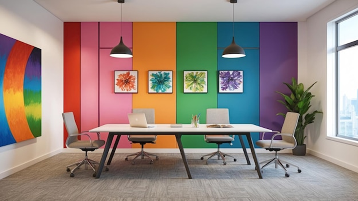
Alright, before we dive into specific shades and their vibes, let’s get one thing straight: the psychology of colors isn’t just artsy fluff, it’s backed by science. Different hues trigger different emotional and psychological responses. Whether it’s making people feel energized, safe, creative, or focused, color sets the tone (pun totally intended).
Think of it like music. Just as a high-tempo song can make you want to dance, a bright red wall might energize a room. Meanwhile, cool blues and greens are the equivalent of a chill lo-fi playlist perfect for deep work and relaxed meetings.
Now let’s look at the major players in color psychology and how they impact your office vibe.
Blue: The Productivity Powerhouse
If you’ve been around corporate offices, you've probably noticed a whole lotta blue. That’s not a coincidence.
What blue says about your brand:
Calm
Trustworthy
Focused
Reliable
Blue tones are like the grown-up of the color world. They help reduce stress, increase focus, and promote clear communication. If your brand is in tech, finance, or consulting, blue's your best friend. It makes you seem dependable and serious without being boring.
Pro tip: Use deeper blues in meeting rooms where big decisions happen. Go lighter in collaborative spaces to keep the energy light and friendly.
Green: The Balance Guru
Want to create a space that feels calm but not sleepy? Say hello to green. It’s the color of balance, nature, and renewal.
What green says about your brand:
Wellness-oriented
Fresh
Balanced
Environmentally conscious
Green is perfect for health-based brands, sustainability companies, or any office that wants to give off peaceful, grounded vibes. It’s also great for reducing eye strain, making it a solid choice for spaces where people spend long hours at screens.
Try this: Add real plants for a pop of natural green (and bonus oxygen). Or go for sage green walls in break areas total stress reliever.
Yellow: The Cheerleader
Ah, yellow. It’s sunshine in a can of paint. But it’s also too tricky and it’s overwhelming, too little and you lose its energy-boosting magic.
What yellow says about your brand:
Optimistic
Creative
Youthful
Energetic
Brands in creative industries (marketing, media, design) often use yellow to spark innovation and encourage big ideas. It’s also great for communal spaces like kitchens, brainstorming rooms, and lounges.
Heads up: Use yellow as an accent color rather than a dominant one. A full yellow room can feel a bit like living inside a lemon.
Red: The Attention-Grabber
Red is bold, emotional, and high-energy. It stimulates the senses and gets your heart pumping literally.
What red says about your brand:
Passionate
Confident
Bold
Action-driven
If you're in a fast-paced environment like sales, marketing, or emergency services, red might work in your favor. But be careful, it can also increase anxiety and tension, so you’ll want to use it in moderation.
Best use: Think red chairs in a breakout room or a red feature wall in a high-impact space. Avoid in quiet zones or focus-heavy areas.
Orange: The Friendly Extrovert
Orange is like red’s more approachable cousin. It’s still energetic, but a bit more playful and creative.
What orange says about your brand:
Sociable
Creative
Adventurous
Fun
Startups, co-working spaces, and companies looking to build a community vibe love orange. It encourages interaction and boosts morale. But like red and yellow, it’s best used in small doses.
Where to use it: Think orange stools in the kitchen or vibrant office signage not an entire orange boardroom.
Purple: The Sophisticated Innovator
Purple has long been associated with royalty, luxury, and creativity. It’s a blend of calm blue and fiery red making it the best of both worlds in some cases.
What purple says about your brand:
Innovative
Wise
Sophisticated
Artistic
This color works great for brands that want to appear forward-thinking and high-end. Think tech disruptors, luxury services, or wellness companies.
Design idea: Use purple in creative spaces or executive offices to inspire imagination and a sense of elevated thinking.
Neutral Tones: The Unsung Heroes
While flashy colors get all the attention, neutrals like white, gray, and beige play an important role. They're the backdrop that lets your brand personality shine.
What neutrals say about your brand:
Clean
Modern
Minimalist
Practical
Too much neutral can feel cold and uninspired, but balanced with accent colors, they’re timeless and professional. Plus, they help bright colors pop without overwhelming your senses.
Tip: Use warm neutrals to make a space feel cozy or cool tones for a modern, sleek look.
Brand Identity and Your Workspace
Here’s the thing: your office isn’t just a place where people sit and type all day. It’s a living reflection of your brand. Whether clients are walking through your halls or employees are spending their 9-to-5 there, every color choice is shaping perception.
Ask yourself:
What emotions do I want people to feel when they enter?
What values does my brand stand for?
Is our current color scheme reinforcing those values or fighting against them?
Let’s say you’re a tech startup that prides itself on creativity and approachability. Dull gray walls might be undermining your message. A little teal or orange could do wonders.
Don’t Forget About Employee Psychology
It's not just about the brand. The psychology of colors also plays a huge role in employee happiness and productivity.
Think about it:
Blue and green help reduce anxiety and boost focus.
Yellow and orange encourage creativity and collaboration.
Neutral tones provide calm and clarity.
Designing your space with your team’s well-being in mind will pay off big-time in morale, efficiency, and even retention. Incorporating tools like vape detectors can also support a healthier workplace by helping maintain clean air and reinforcing safety policies. Happy employees = better results.
Open Spaces vs. Private Offices: Color Tactics
Not all spaces are created equal, right? Open areas like shared desks or lounges call for energizing and inclusive tones. Think soft blues, greens, or pops of yellow to keep the vibe upbeat.
Private offices or phone booths? Go calmer. Light gray, sage, or muted purples are great for concentration and privacy.
Fun idea: If your office allows it, let team members customize their space with a color accent wall. It adds personality and gives them a sense of ownership.
Going Beyond Walls: Furniture, Decor & Branding
Colors aren’t limited to the paint you slap on the walls. Think:
Office chairs
Desk mats
Wall art
Signage
Lighting
Subtle things like a red mug or a green couch can reinforce your brand vibe without screaming for attention. Don’t forget your digital presence should match too your brand colors should show up on your website, social media, and even internal documents.
Consistency is key. The more aligned your space is with your brand's identity, the more memorable it becomes.
A Quick Word on Cleanliness
Here’s something people don’t often talk about: no matter how great your color scheme is, if your space isn’t clean, it’ll mess up the whole effect.
Nobody's going to appreciate your perfectly curated palette if there's dust on the light fixtures or funky smells coming from the vents. This is where something as un-glamorous as furnace and duct cleaning makes a big difference. A clean space enhances every single design choice you’ve made plus, it’s better for health and productivity.
Final Thoughts: Let Your Colors Speak
So, what’s your office palette really saying about your brand? Is it whispering calm and clarity? Shouting energy and creativity? Or just kind of mumbling “we haven’t thought about this at all”?
Colors aren’t just decoration, they’re communication. The psychology of colors has the power to shape mood, influence decisions, and create lasting impressions.
If you’re redesigning your workspace or setting up a new one, don’t just go with what’s trendy. Think about your brand’s core values, your team’s needs, and how you want people to feel in your space.